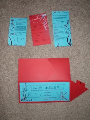
I described how I made my pocketfolds in my previous post, so let's move on to the actual inserts themselves!
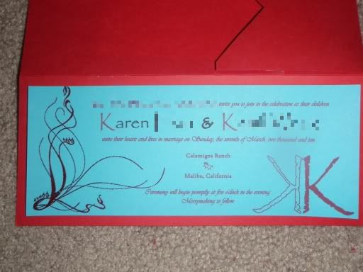
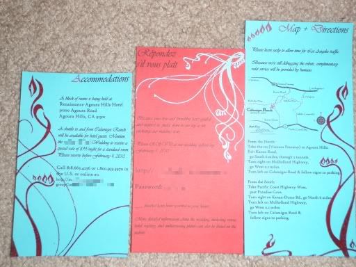
We only had a main invitation, map & directions card, accommodations card, and a RSVP card (which directed people to RSVP online via our website, so we didn't have to include a reply envelope)! My fiance designed the text layout, I printed them using a bridesmaid's color printer, and I cut all the inserts based off the dimensions of my pocketfold. The fire & water designs that you see in the left and right corners are the embossed designs.
I researched a lot of different invitation and insert card wordings before we came up with ours, so I wanted to share what we put:
The main insert text reads:
[Bride's Mom & Dad] and [Groom's Mom & Dad] invite you to join in the celebration as their children
[Bride] & [Groom]
unite their hearts and lives in marriage on Sunday, the seventh of March, two thousand and ten.
Calamigos Ranch
Malibu, California
Ceremony will begin promptly at five o'clock in the evening.
Merrymaking to follow.
Accommodations insert text reads:
A block of rooms is being held at:
[Hotel address]
A shuttle to and from Calamigos Ranch will be available for hotel guests. Mention the [Bride/Groom Last Names] Wedding to receive a special rate of $99/night for a standard room. Please reserve before February 4, 2010.
[Hotel contact info]
RSVP text reads:
Because your love and friendship have guided and inspired us, please share in our joy as we exchange our wedding vows.
Please RSVP at our wedding website by February 1, 2010:
[Website URL & password]
___ place(s) have been reserved in your honor (we hand-wrote these numbers in)
More detailed information about the wedding, including venue, hotel, registry, and embarassing photos can also be found on the website.
Map & Directions text reads:
Please leave early to allow time for Los Angeles traffic.
Because we're still debugging the robots, complimentary valet service will be provided by humans. (My husband's field of work is with automated robotics such as this, so we put this in as a joke as well as to let people know that valet parking was free!)
[Map & written directions]
Again, the red insert card was the Mohawk Via Vellum 80# coverweight paper in scarlet (same as the red pocketfold) and the blue insert cards were the Astrobright 65# coverweight paper in lunar blue. If you're going for bright, unique colors to match your wedding scheme, you'll most likely end up with the Astrobright line of papers.
First off, one of the design elements in my wedding was fire & water, so we asked one of my bridesmaids who was also an artist to design the graphics based off of a lot of fire/water references I pulled off istockphoto.com. If you don't have an artist friend to beg for help, I'd highly recommend just pulling something off there! They have a LOT of great and cheap images. Here are a few of the references I sent her, although she looked up plenty of her own as well that were much better:
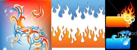
(These were 10490321, 3596259, 4723348 if you're interested)
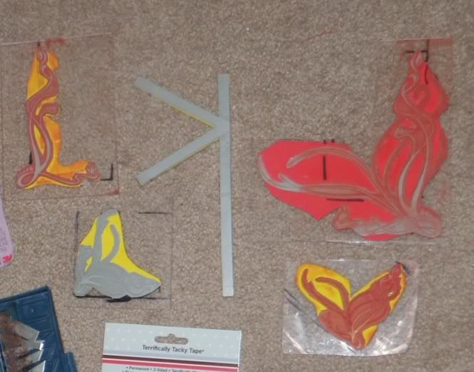
She created the designs as a vector, and my other bridesmaid works at a company that happens to have a laser-cutting printer! So we made stamps with the designs by laser-cutting rubber, and glued it to a sheet of acrylic and foam backing (to help distribute the pressure when pressing down on the stamp). We tried stamping without the foam and it came out MUCH better with a foamie backing. We also didn't cut the design into the rubber deep enough, so we had to be extra careful when stamping the ink to avoid smudging. Super annoying!
(I have a picture of my bridesmaid staring at the laser printer as the stamp was being cut; I'll put it here tomorrow!)
Here are the five stamps that got created (the red & yellow is the foam backing).
Some words of advice on embossing:
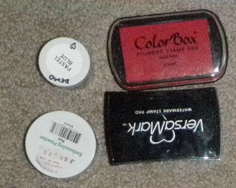
1) Remember how I mentioned the pitfalls of using colored paper in the previous tutorial? The same applies for embossing as well as printing - the color of the embossing stamp ink and powder come out differently depending on your paper color (and probably paper type as well). So to get an exact shade, you have to practice with a lot of different colored inks and powders. In conclusion, if you have a choice, go with WHITE paper!
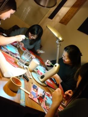
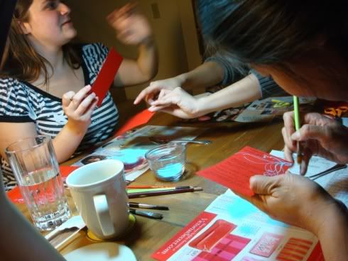
2) With embossing, you basically stamp on some slow-drying ink, cover it with embossing powder, brush off the excess powder, and heat blast the powder until it melts together. Slow-drying ink (PIGMENT ink) is required for this purpose because otherwise the ink will dry too quickly for the powder to catch on. People also recommend the combination of colored ink and transparent powder rather than the other way around (transparent ink and colored powder) because when the powder melts together, it doesn't always do so smoothly, especially if you don't have an ultra-fine powder. So you get left with tiny little bumps and "dents" in your design. Another reason is that you'll get excess powder clinging to the paper, and if the powder is clear, it's not really a problem. Since I used colored powder, I employed my lucky bridesmaids to take paintbrushes to the invitations and brush off the excess powder. Like so!
3) YES, you can achieve a very fine level of detail with embossing - pretty much exactly what you stamp onto the paper will come out in the embossing. I was skeptical of this at first, but trust me.. it's precise!
So what I ended up using was: for the blue emboss on the red paper, I used the Versamark watermark ink (transparent), and then Pastel Blue Stamp A Mania embossing powder to achieve the exact blue color. For the red emboss on blue paper, I wasn't so lucky, so the closest I got was using the Colormark pigment stamp in Scarlet with Judi Kins embossing powder in red - this yielded a darker, more blood red color on the blue paper, but I was past caring at this point. (This was, however, a better red than I got with transparent ink and colored powder, and other shades and brands of red pigment ink.)
There have been a ton of great embossing tutorials posted online, so I'll just link to a few that have documented it much better than I could: Heat Embossing on Weddingbee, How To Emboss in Weddingbee, Paper Source's How To videos.
Embossing is very easy, somewhat time consuming (but much less so if you use clear powder), but VERY worth it. They create a lovely raised design that add a lot of extra detail to your invitations, and your guests WILL notice. Walk into your local stamping store or Paper Source and they'll be happy to show you a demo! Beware though; you'll most likely walk out of there with tons of embossing supplies and make a lot more work for yourself.
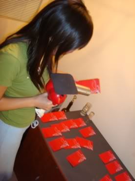
After all the embossing, I smeared glue-stick on the back of the main invite and manually aligned it onto the pocketfold. The main invitation was cut to a particular dimension that would allow a consistent-width border around the edges.
Fin! (We wanted to emboss just about everything paper-related for the wedding, but after this ordeal I was pretty much over it!)
No comments:
Post a Comment